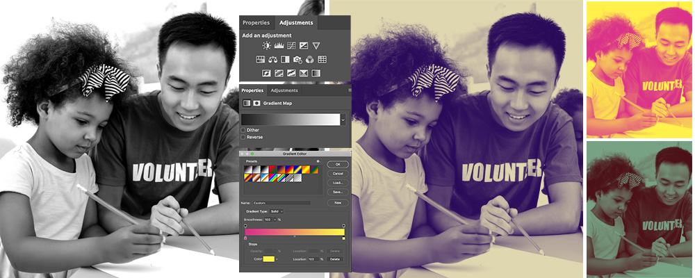

Who doesn’t love a good photo effect?
One popular design trend we’re seeing is the duotone effect. If you’ve spent any time on Spotify, you’ve seen duotone images. It’s part of their signature look. Their use has helped increase the popularity of duotone across print and the internet.
Although it’s being used in fun new ways, duotone isn’t new. Colors used to be expensive to print, so duotone images ruled the printing press. Familiar with sepia? You’ve seen duotone print. The old photos were typically muted, but today’s experiments in duotone are often brightly colored.
DIY Duotone
Duotone is not a difficult effect to produce, but it looks great. It can be used to add a fun pop to your website or publication, create a sense of drama, give a modern twist, or establish a consistent look. This effect can be done in Photoshop with any photo, but works best with high-contrast black and white photos.
The first time you try it, I recommend using a black and white image so you can more easily see the contrast in values.
Step By Step
To create the duotone effect in Photoshop, follow these simple instructions:
- Open your image in Photoshop.
- Select the Image > Mode menu item to ensure color mode is set to RGB Color or CMYK Color.
- Select the Layer > New Adjustment Layer > Gradient Map menu item to create a gradient map, and then click OK to accept the default settings for the new layer.
- On the Properties tab of the Gradient Map panel, single or double click the gradient bar to open the Gradient Editor window.
- Double-click the bottom left-hand Color Stop slider to select the darker of the two hues you’d like to use for your duotone effect. This will open the Color Picker window where you can select your desired hue, and click OK once your desired hue is displayed in the “new” section of the control window.
- Now double-click the bottom right-hand Color Stop slider to select the lighter of the two hues you’d like to use for your duotone effect, and click OK once your desired hue is displayed in the “new” section of the control window.
- Repeat steps a) and b) as needed to preview the result of various hue selections. Click OK on the Gradient Editor window when satisfied with the result.
- Select the File > Save As menu item to save the duotone version of your image. Consider using a unique file name for the duotone image so your original image is left unchanged.
A Few Pointers
Start simple. Begin with a black and white image, and limit your duotone effect to two colors, one light one dark. I recommend choosing the dark color first to avoid an inverted look.
Double the Fun
Once you’ve got the basics down, have a little fun. You can add a third color to your image. To do this, open up the gradient map and use the third Color Stop slider to pick the third color you want to add to your palette.
Make it Look Good
There’s no exact science to creating a duotone effect. Have some fun, but keep in mind where this image will end up. Purple and yellow make a fun combination, but may not be appropriate for a flier that will be handed out at your next board meeting. You know your audience, so choose colors and effects that reflect your brand, help instead of hinder your purpose and look good.
There are many ways to catch a reader’s eye, and duotone is a fun, simple tool to add to your belt. It’s a popular trend right now, but also easy to make this effect look like it was done by professionals.
