One big advertising and marketing trend we’ve seen lately is the less polished content shared on digital platforms. It shouldn’t be so surprising – audiences want authenticity. It’s not new, but it seems to be everywhere now.
When you look at TikTok, the fastest-growing social media platform, it’s rarely the highly produced and calculated videos making it big. If you scroll through the account of Charli D’Amelio, who has almost 140 million subscribers and was the highest-paid TikTok star of 2021, you’ll see a lot of videos where she’s using her phone to record in front of a mirror, or filming a lip sync video in selfie mode while sitting in the car. D’Amelio is young, pretty, has an extensive wardrobe, and is plenty skilled with a makeup brush. Part of her appeal, though, comes from her willingness to post videos in her pajamas or without makeup on while having an acne outbreak.
Why is that appealing?
Because people crave authenticity. Specifically, Gen Z craves reality and authenticity. They trust real people more than celebrities, and they’re good at sniffing out fakes.
So how does that translate to print? It’s not like you would pour time and resources into a printed piece only to run a blurry photo. Or would you?
REI Does It Right
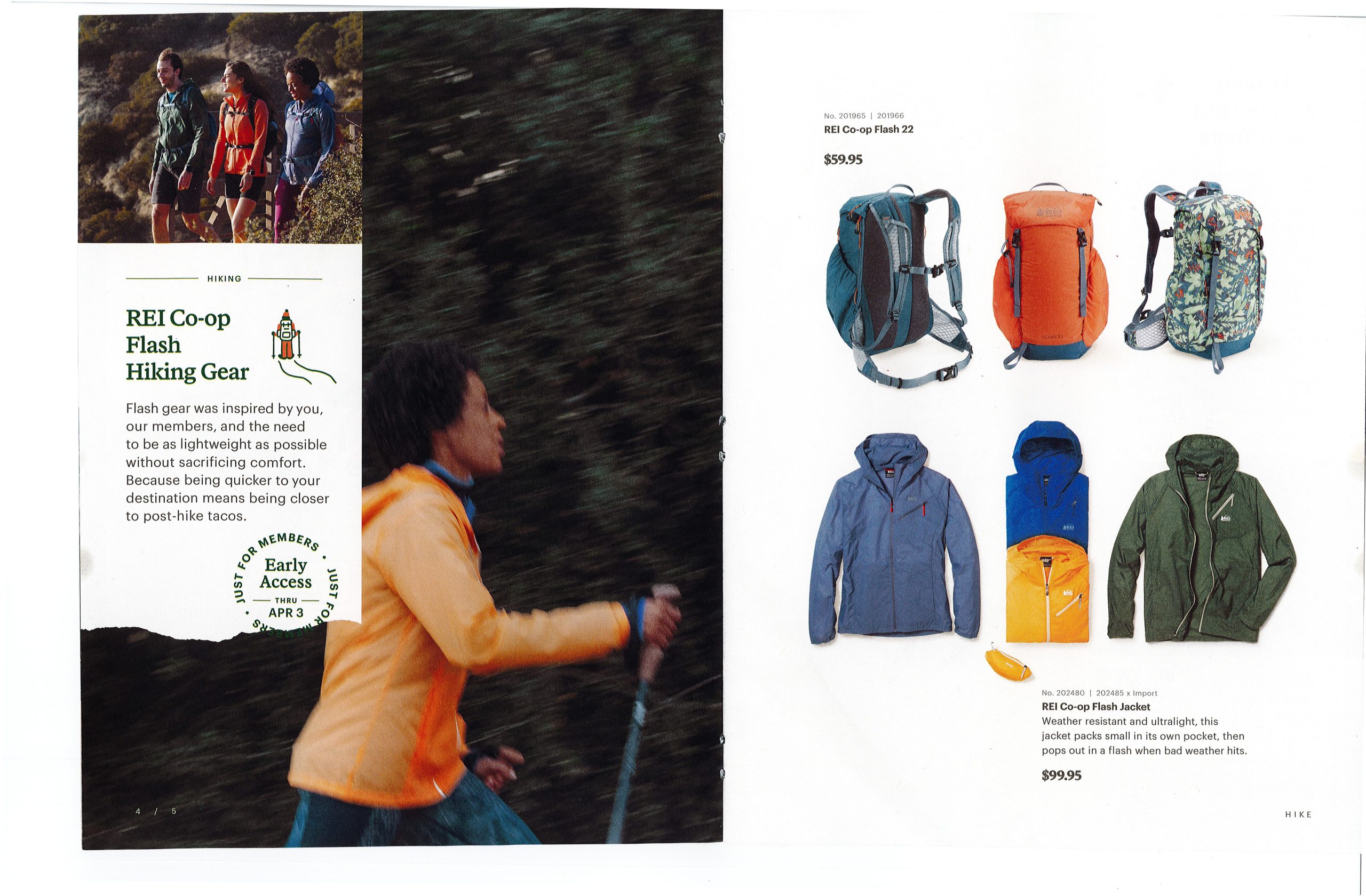
Flipping through a recent REI catalog, I had to double back a page when something registered – that was a slightly blurry, almost full-page photo! Of course, it was artfully done, conveyed motion, and you could still make out the hiker wearing an orange jacket to connect that slightly blurry jacket to a crisp cutout of that same jacket on the next page. But still! And it didn’t even register as unusual at first!
A few pages later, the slightly blurry heads and torsos of two runners whiz by in the center of the spread. But you can make out enough to see that these are the two runners seen in the previous spread, wearing the same clothes in both photos. One runner wears a baseball cap and the other has her hair pulled back in a braid – like runners actually do.
It’s only a 12-page catalog, but the same few people are shown multiple times. A group of three hikers is silhouetted on the cover, but you can just make out that the same three people appear on page four. If they weren’t all decked head-to-toe in gear from REI, these photos almost look like pictures I would take on a casual hike with friends. It all feels very intimate and authentic.
YETI is the King of Practiced Authenticity
My colleagues and I started chatting about interesting catalogs we’ve seen lately (as the cool kids do), and one brought in a recent YETI catalog for me to review.
The front page of the YETI Dispatch shows Malik Martin climbing a mountain. Not a single piece of YETI gear is visible. Opening the cover, there’s a photo of JT Van Zandt and Lauren Spalding at the end of the 260-mile Texas Water Safari canoe race. They’re wet and rumpled. JT is holding a beer and missing a shoe. Lauren is barefoot. The only visible YETI logo is on JT’s hat.
The YETI catalog includes in-depth stories and photos that don’t seem to be selling anything. In fact, in the 68-page catalog, only 35 pages are actually devoted to selling products. The other 33 pages feature in-depth articles or photos often without a single YETI product visible in them.
Even though the YETI team must have worked very hard to put this catalog together, the end product feels slightly unpolished, very real and completely authentic.
How Do I Do This?
Because REI and YETI are both B2C outdoor adventure brands, we will admit that embracing the unpolished is a little bit easier for them. But that doesn’t mean you couldn’t, too!
Could you crowd-source photos from your customers? Could you hire a freelancer to write something?
If you sell farming equipment, what might a one-page profile of a farmer do to help your brand stand out? If you sell auto parts, could you include a few candid images of people laughing at an auto show? Or a mechanic who’s been working on cars all day? If you sell board or card games, you could search social media for photos of people playing that game and ask permission to use those images in your catalog.
Think about the way your product will be used. Think about the people who will interact with it. Then set aside a small part of your catalog to highlight those. And don’t worry about that section being perfect. In fact, it’s better if it isn’t.


