
Writing a book is a long and arduous process. Whether it’s a novel, a textbook or a coffee table book, it can take years to put together the contents of your book. And once all the copy has been written and edited, there’s still an important task at hand: design. Even though book design might not seem that important, it can make the difference between a book that sits on shelves and one that is begging to be picked up and read.
This blog will provide an overview of basic book design and how it can help create an eye-catching, easy-to-read book.
Typography: The Art of Choosing the Perfect Font
Typography determines how the words of your book will appear on the page. This includes the font choice and font size for body text and headers. When choosing a font for body text, we recommend something easy to read, like a serif or sans serif font. Serif fonts, like Times New Roman and Garamond, use serifs, which are small lines on the ends of letters. Serif fonts tend to have a more classic, formal look. Sans serif fonts, on the other hand, lend more of a casual vibe to your body text. Arial and Helvetica are popular examples of sans serif fonts. There’s a little more flexibility when choosing header fonts since they don’t require the same level of readability as body text. However, it’s important that your font choices remain consistent across the book – don’t switch it up halfway through the book.
You’ll enjoy the most freedom when choosing a font for your book title as it appears on the cover. While it still needs to be readable, this is where you can choose a font that contributes to your overall cover design (more on this later).
The other important consideration in typography is font size. Body text that’s too small will be difficult to read, while a large font will require more paper. 10-12 pt. font is usually a good target range for body text; headers tend to be a bit bigger.
Page Layout: Crafting a Reader-Friendly Experience
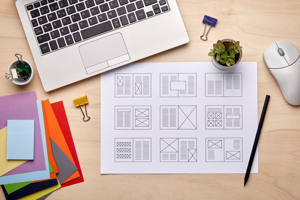
Page layout can be just as much of a boon to readability as typography. The main considerations when designing page layout are margins, spacing and subheadings, to name a few. Margins, or the amount of blank space between the edges of the page and where the text begins, have a big impact on readability and the overall look of your book. Similarly, the spacing between paragraphs and individual lines of text can make or break the overall look of your page. With margins and spacing, it’s important to find the right amount of space so your copy is readable without looking sparse.
Cover Design 101: Creating a First Impression that Sells
Your book cover is like a movie trailer – it has seconds to grab a reader’s attention and convince them to dive into your story. So, how do you craft a cover that sells? Let’s break it down:
Understanding the Cover’s Role
Grab the Reader’s Attention: In a crowded bookstore or on a busy online platform, your cover needs to be an instant eye-catcher. Bold colors, intriguing imagery, and a clear focal point are all essential for making that initial connection. For a coffee table book, choose an especially nice photograph that sums up the book’s overall theme.
Communicate the Genre: A well-designed cover subtly conveys the genre of your book. Think dark, suspenseful tones for a thriller, or sweeping landscapes and fantastical creatures for a fantasy novel. The cover art should prime the reader for the kind of experience they can expect from your book.
Intrigue without Spoiling the Surprise: Don’t give away the entire plot on the cover! Instead, use symbolism, imagery or evocative settings to pique the reader’s curiosity and leave them wanting more.
Cover Design Elements
Now that you understand the cover’s role, let’s get into the nitty-gritty of design elements:
Focal Point: Every cover needs a central element that draws the eye in. This could be a powerful image, a symbolic object or even a well-designed title.
Imagery: Genre Conventions & Choices:
- Genre Specifics: Consider genre conventions. Romance covers often feature couples or symbolic objects like roses. Sci-fi and fantasy can embrace spaceships, futuristic cities or fantastical creatures.
- Photos vs. Illustrations: Photos can lend a realistic feel, while illustrations allow for more creative freedom to match your unique story. A textbook or other piece of non-fiction may benefit from a photographic cover to help convey its informative tone.
Title and Author Treatment:
- Font Matters: Choose a bold, eye-catching font for your title. Consider the genre when selecting fonts – a whimsical script might work for a children’s book, while a bold sans-serif font could be more fitting for a thriller.
- Size and Hierarchy: The title should be the most prominent element, followed by the author name and any subtitles.
Color Scheme: Colors are powerful! Use color psychology to your advantage. Warm colors like reds and oranges can evoke excitement or energy, while cool colors like blues and greens suggest calmness or mystery. Consider the overall mood you want to create and choose a color palette that reflects it.
Paperback vs. Hardcover
When designing your book, you’ll undoubtedly face an important decision; paperback or hardcover. Paperback books are cheaper to print and offer the benefits of being more lightweight and flexible than their counterpart. Hardcover books, on the other hand, are much more durable than paperbacks and tend to support more intricate designs and finishes, such as embossing, debossing and gold foil.
If you’re a fledgling author trying to make a name for yourself, a paperback may the the way to go – a lower price means a lower barrier of entry for your potential readers, who may be more willing to take a chance on a cheaper paperback. However, if you’re designing a textbook or coffee table book, hardcover is likely the safer bet – it will fare better against years of being flipped open and browsed.
Choosing Your Paper: Essential Specs for Your Book
Your paper choice will determine how your book feels to its readers. Lighter paper is generally more budget-friendly and takes some of the weight out of the book – it may be appropriate for a particularly long or large book, like a textbook or encyclopedia. Heavier paper, obviously, will weigh more. Along with that extra weight comes enhanced durability, as the pages will be less likely to rip and tear with repeated use.
After choosing the paper, you’ll likely be presented with coating options. Paper coatings are sort of like wood finishes; they can change the look and feel of your paper without affecting the text underneath. Particularly image-heavy books generally benefit from a glossy coating to make photographs pop, while novels tend to enjoy matte coatings for maximum readability.
Create an Outstanding Book With Walsworth
Now that you’ve learned what goes into designing a book, why not put it into action? Walsworth’s state-of-the-art printing facilities are renowned for creating stunning, high-quality books with a wide variety of paper, binding and finishing options. Our skilled employees can help you take your book project from design to print, resulting in a book that matches your vision. Ready to get started? Get in touch with us today!


