
Your brand relies on accurate print color. According to Idealliance, “Color consistency reinforces trust. Inconsistency with colors associated with a brand subconsciously diminishes it, and erodes brand loyalty.” You also want the images in your publication to stay true to the artist’s vision and/or accurately show what’s being pictured.
But how can you achieve consistent, accurate print color?
Color Modes
There are a few different ways to achieve accurate print color. In general, RGB is used for electronic displays like your computer screen, and CMYK is typically used in offset printing.

CMYK
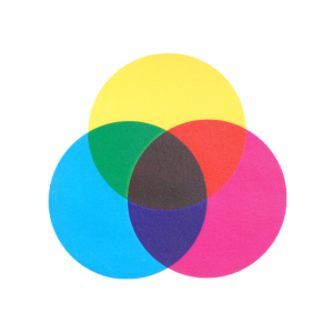
Most commercial printing uses the CMYK color model. Those four letters each represent a color: cyan, magenta, yellow and black. Think of it like this: you start with a white sheet of paper, then the sheet gets darker as more color is added. Combining the colors you have (cyan, magenta, yellow and black) creates a vast palette. CMYK is called subtractive mixing because as colors are added to the page, the light reflected from the page is reduced.

RGB
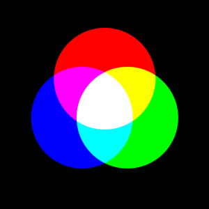
The RGB model uses red, green and blue color combinations to create a wide array of colors. RGB is known as additive mixing because you start with black, then add and combine red, green and blue light to get colors. The more color you add, the more light gets reflected off the page or screen. If you mix all your colors, you get white.
Spot Color
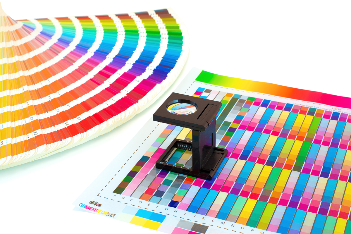
Spot color is used when you need a precise, specific color. For example, a John Deere catalog might use spot color to ensure they get that specific shade of green. If you have a specific Pantone color you’re using – maybe the Pantone Color of the Year – you might use spot color.
“The thing to be careful of with Pantone is that there is absolutely no substitute for a swatch book or an ink drawdown. What you see on a screen – even when looking at Pantone’s own website – can be drastically different from how the actual ink will print,” Prepress technician and Certified G7 Expert John Myers cautioned.
Setting Yourself Up for Success
There are a few things you can do to set up your publication for accurate print color.
When designing, Myers recommends working in CMYK whenever possible. This is because art created in RGB colorspace will need to be converted to CMYK ink channels. This can cause unexpected changes in tonality (how light and dark the image is).
“The color you see on the screen is not necessarily what you will see on the printed piece. There is no substitute for printed samples or color proofs when it comes to knowing exactly what you are going to get,” he said. Myers also recommended looking at your samples under different lighting conditions, like fluorescents, LEDs, natural light, etc.
If you prefer designing your publication in RGB, most programs will allow you to convert from RGB to CMYK. Walsworth can accept RGB images, but we recommend our customers convert to CMYK before submitting their files.
One common color issue we see is with font colors. Sometimes fonts intended to be 100% black will contain cyan, magenta or yellow, which will affect the color of your text. (CMYK needs black as a fourth color because combining just cyan, magenta and yellow will create a deep brown instead of a true black.) Fortunately, this is a fairly easy issue to check. In InDesign, you can use the Separations Preview to see if the black type contains other inks. In Acrobat Pro, Output Preview can be used the same way.
One more way to ensure accurate print color is by seeing the product for yourself. Myers recommended visiting for a press check if possible.
“Printing is infinitely more complicated than it can seem from the outside and getting an inside look at what goes into creating the finished piece is invaluable. Come to the plant and watch the presses run, give input on color on the fly, and learn more about how the sausage is made, so to speak.”
Precise Printing
We’ve used the term “G7 certified” a lot. But what does it mean?
The G7 certification program is an international calibration methodology that helps ensure uniform color across all print mediums. When a commercial printer achieves G7 certification, it shows their commitment to quality and consistency. G7 qualification is issued according to three distinct compliance levels. The qualification is issued to the facility – for example, Walsworth’s plants in Fulton, Missouri, Ripon, Wisconsin, and Saint Joseph, Michigan, achieved G7 certification independently. A printer must meet the requirements for each G7 compliance level to achieve G7 Master Qualification status.
G7 Grayscale: The fundamental level of G7, this compliance level ensures that neutral tones are calibrated to match with the ideal G7 neutral density curve. Successfully printing these colors makes it far more likely a printer can recreate other colors across the CMYK spectrum.
G7 Targeted: This level is achieved when Grayscale compliance is met, and the solid ink measurements for primary and secondary colors (CMY and RGB) and substrate colors are within the spec of the G7-based color targets.
G7 Colorspace: This level demonstrates that extremely tight tolerances are maintained throughout the entire color spectrum, using an entire IT8.7/4 target. This level is also divided into printing and proofing processes, with stricter requirements for proofing.
A G7 certification means you can expect excellent consistency, efficiency and communication on your printed project.
The Importance of Proofs
“The biggest concern for getting color right is consistency,” Myers said. “If you want one printed piece to match another or to match a physical product, you need to be very careful about how the art is built and supplied to the printer. Once again, there is no substitute for printed samples or color proofs when it comes to knowing exactly what you are going to get. Things like lighting can play a very important role If you’re looking at something under fluorescence versus natural light or incandescent.”
If you’re serious about creating an exact color profile, it’s important to carefully proof your product, as there are many factors in the printing process that can affect how colors appear. “In the industry, we also talk about paper as being the fifth color, because the substrate you print on can be wildly different from another. You could print the same page on the same press on two different substrates, and they could look wildly different depending on the quality of the paper and what kind of optical brighteners are used,” said Myers.
Getting It Right With Walsworth
You want your colors to be perfect. Getting accurate print color is important to Walsworth. Our G7-certified facilities and experts can help ensure you receive a product that looks great. Reach out and one of our dedicated Sales Representatives will be in touch.
