
As a publisher you likely know this feeling: you spend countless hours on your print project and hold your breath as you hit the submit button. Then you exhale in relief, happy to be getting that big task off your plate. The last thing you want is to receive your proofs back with lots of required edits which will cost valuable time.
Walsworth wants to help ensure that doesn’t happen. The good news is there are measures you can take to avoid those time-sucking edits. Here are six of the most common errors our Prepress department sees, with tips on how to avoid them.
Click on any of the images below to view the larger version.
 1. Document Setup
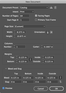
Even though trim size is usually a quick fix, it’s best to get it right the first time. Build your document to the final trim size with a minimum of an 1/8” margin for the Live Area and an 1/8” for Bleed trims. Live Area refers to text or objects that do not extend to the edge of the page. Bleed refers to images and text that do extend to the edge of the page, or “bleed off” the page, where they will be trimmed off the final page size. Images in the bleed area must be extended an 1/8″ beyond trim.
 2. Marks Too Close to Trim
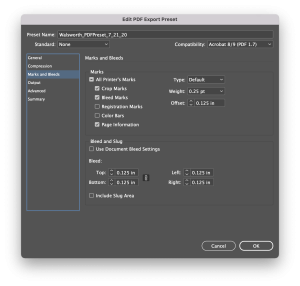
Unless the default Offset amount is changed, InDesign generates crop marks that are too close to the trim. For Offset, enter .125 inches in the Marks and Bleeds section of the PDF Export dialog box. Our PDF Export Settings use .125 inches for Offset. Click here to download our PDF Export Settings for InDesign. For more help, our Prepress experts can provide guidance.
3. Image Resolution
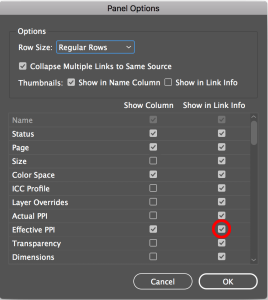
Low-resolution images (any image with an effective resolution below 200 ppi) should be replaced before exporting a PDF. You can use Live Preflight in InDesign to be alerted about any images considered low-resolution, or similarly, in the Links panel.
Note: You will have to modify the Preflight settings and the Links panel if you want to be alerted about the inclusion of any low-res images.
4. Inks
Unless your document prints with a PMS (spot color), it should only contain CMYK text and images. You can use the Separations Preview panel in InDesign or the Output Preview panel in Acrobat Pro to see how the colors are built – either CMYK, RGB or PMS – in your document. All colors should be converted to CMYK (RGB won’t work), unless you are printing with a spot color.
Note: Although Walsworth will accept RGB images, we recommend converting RGB to CMYK.
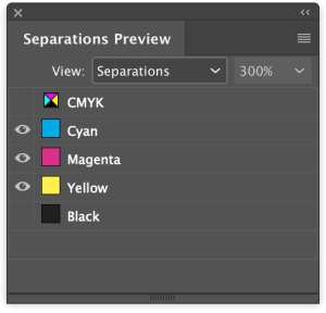
A screenshot of the Separations Preview toolbar through InDesign. It shows the different color seperations of CMYK.
5. Font Color
Sometimes fonts intended to be 100% black actually contain cyan, magenta and yellow, the CMY in CMYK. There are several reasons why this happens. Typically, the Registration Swatch is accidentally picked instead of the Black Swatch or an RGB Swatch is selected. Use Separations Preview in InDesign (Window > Output > Separations Preview) or Output Preview in Acrobat Pro (Print Production Tools > Output Preview) to see if black type contains other inks.
6. Font Embedding
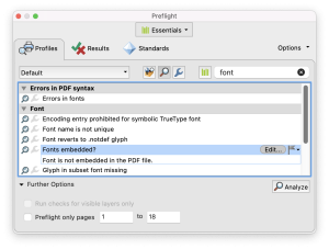
To avoid font substitution or output errors, it’s important all fonts are embedded in your document. Use Preflight in Acrobat Pro to check if all the fonts used in the PDF are embedded. If they aren’t, Adobe has step-by-step instructions on how to embed fonts in a PDF.
Checking for these common issues should cut down on mistakes, but this blog post doesn’t cover everything. If you have questions about your file, please reach out to your Customer Support Representative or you can email James directly at james.wamser@walsworth.com. You can also check out some of our helpful webinars, like Adobe Tips for the Creative Pro.

