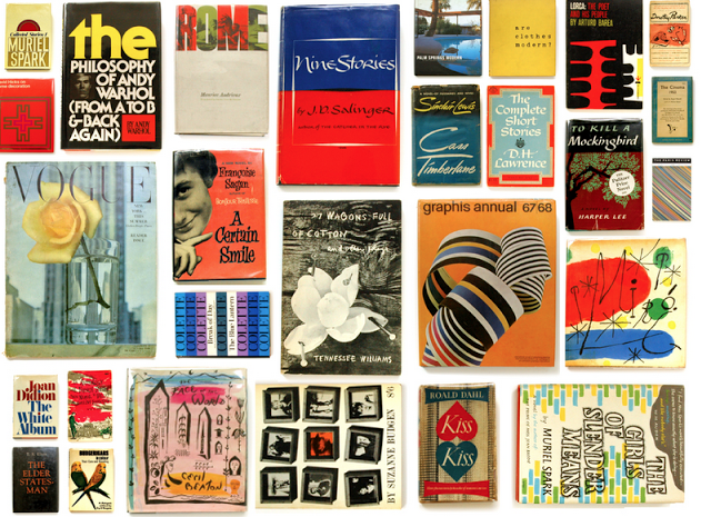

According to Bowker, the official ISBN Agency for the United States and its territories, the number of self-published books skyrocketed to more than 391,000 in 2012, up more than 59 percent from the previous year.
Bowker noted traditional publishing is still on the rise too. Your book has to compete with all of these for the buyer’s attention – your book cover may be your first, best and only chance to capture the buyer’s heart.
Your book cover should tell the buyer what the book is about, give a general idea of the emotion or knowledge a reader should walk away with, and tell why you are the best person to present the information.
1. Behold the Power of the Cover
 People will literally judge your book by its cover. They cannot help it – humans are visual. In fact, in an article entitled “Judging a Book by its Cover,” Psychology Today magazine says that the visual area comprises 30 percent of the cortex, located near the back of the human brain.
So, put as much thought into your cover as you did creating the title of your book.
2. Avoid Homemade Drawings
Nothing shouts “Stay away from this book” like a homemade drawing. Avoid homemade drawings unless you are a professional artist.
3. Create an Informative Back Cover
An amazing front cover is eye candy that tells the buyer your book is worth a second glance. The buyer spends that second glance looking at the back cover. The back cover should be an infomercial that validates the buyer’s excitement and assures him your book is worth the investment.
4. Remember your Genre
Your cover should reflect the genre of the book. A picture of a couple kissing is appropriate for a romance novel, for example, but inappropriate for a book on nuclear engineering.
5. Be Simple
When in doubt, go for a minimalist style. A simple photograph or drawing with a title header and byline footer works very well in almost all settings. Choose your imagery carefully – you need to make a lasting impression in the customer’s mind.
6. Be Strong
Be bold with your imagery. A cover depicting a robotic hand holding a kitten would spark more interest in a non-fiction book about the role of technology in veterinary care than one sporting a picture of a mild-mannered veterinarian.
7. Be Symbolic
Your cover needs to make a connection with buyers. Choose images that are symbolic or iconic so they will evoke a special emotion or create a new meaning.
8. Be Vague … or Be Specific
Photos for fiction books should be vague while pictures on non-fiction book covers should be specific. Let the reader imagine what the lead character looks like in a fiction, for example, but show the buyer the exact chip set you are talking about on a cover for a book about the history of computers.
9. Color
Aside from your photograph, limit your book cover to three colors. Use bold, contrasting colors that really pop off the page.
10. Easy to Read Font
Choose a common font that is easy to read from a distance. Use 3D effects and drop shadows to create extra effects, but use these effects sparingly for the most dramatic effect.
Your book cover is your primary source of marketing, especially if you are a first time author. The main goal of your book cover is to create excitement about your book. The cover should serve as a two-dimensional advertisement for what the buyer might expect to find inside the book.
It should stop people in their tracks and compel them to purchase your book. Designing an amazing cover will do wonders for your book
