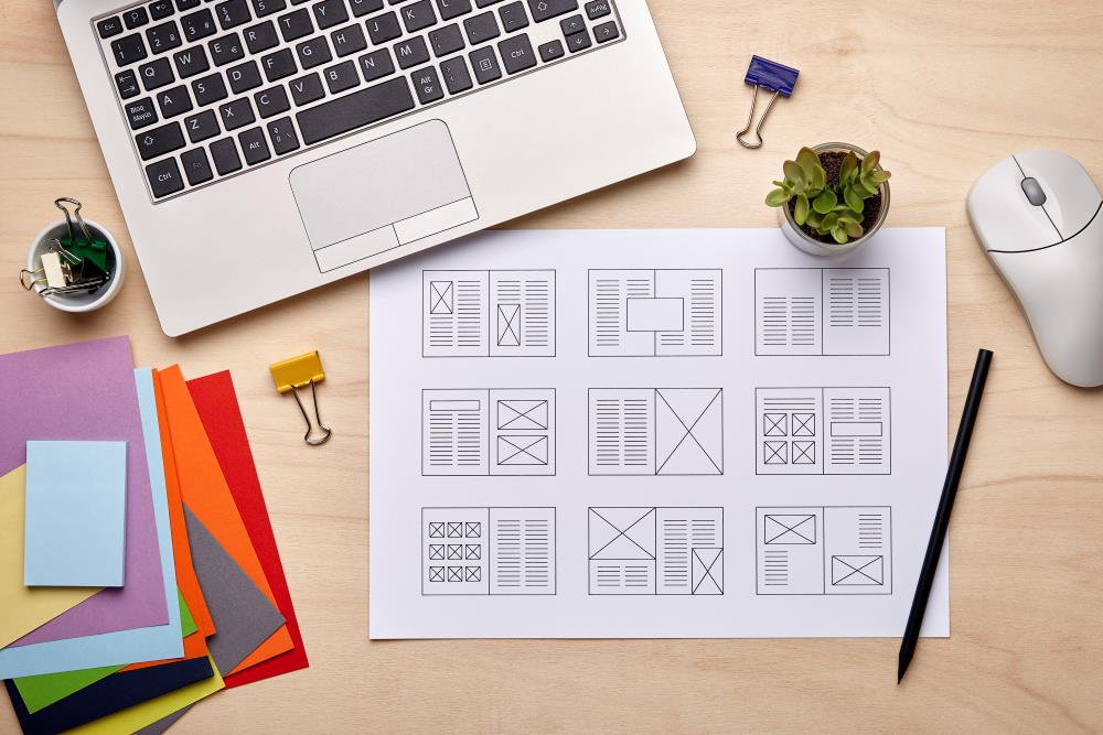

Designing a magazine layout is a dynamic process that requires a blend of creativity and technical know-how. Whether you’re creating a brand new magazine, making a change to your existing publication’s layout or transitioning to a new editorial team, implementing a structured approach can significantly enhance the visual appeal and readability of your publication. In this comprehensive guide, we’ll delve into the specifics of designing a magazine layout, from using tools like Adobe InDesign to following specifications and optimizing the placement of copy and images.
Choosing the Right Tool: Adobe InDesign
Adobe InDesign stands out as the industry-standard software for magazine layout design. Its robust features make it well-suited for handling complex layouts, ensuring a seamless workflow for professionals. Begin by setting up your document with the appropriate specifications, such as page size, margins and bleed settings. It’s easy to get set up by using our quick start guides. Familiarizing yourself with InDesign’s tools and functionalities is crucial for efficient and effective design.
Understanding Specifications: Size, Bleed, and Margins
Before diving into the creative process, make sure you understand the specifications for your magazine layout. Consider the standard sizes for magazines and choose one that aligns with your content and audience preferences. Incorporate a bleed – an extra margin beyond the edge of your page – to accommodate printing and trimming variations.
Set up proper margins to ensure a balanced and aesthetically pleasing design while leaving room for important elements like headers and footers. Your printing partner will most likely have a standard set of specifications to follow to ensure your design is printed accurately.
Page Structure: Grids and Columns
Establishing a grid system is fundamental to a well-organized magazine layout. Divide your pages into columns to create a structure that guides the placement of elements consistently. This grid system helps maintain a visual hierarchy, making it easier for readers to navigate your content. Adobe InDesign provides easy-to-use tools for setting up grids, allowing for flexibility and precision in your design.
Placing Copy: Headlines, Subheadings, and Body Text
Strategic placement of copy is crucial for conveying your message effectively. Start with compelling headlines that capture attention and provide a glimpse into the content. Use subheadings to break down sections and improve readability. When placing body text, pay attention to font choice, size and spacing.
Consistency in typography across your magazine helps improve readability while also establishing your brand image.
Image Placement: Balance and Alignment
Images play a pivotal role in magazine design, adding visual interest and complementing your written content. Ensure high-quality images that resonate with your audience and enhance your message. Balance image placement across pages, avoiding overcrowding or isolation. Align images with text and maintain a consistent style to create a balanced and pleasing visual experience.
Typography: Font Choices and Styles
Typography is a critical aspect of magazine layout design. Choose fonts that contribute to the overall aesthetic of your publication. Consider using a combination of fonts for headlines, subheadings and body text to create a distinct hierarchy while also adding variety. Use styling such as bold, italics and underline, when appropriate, to emphasize key points and create visual contrast.
Once you’ve found the perfect style for your magazine, it’s easy to save those specifications for future editions. “To save time and provide consistency, we recommend using Character, Paragraph and Object Style sheets,” says James Wamser, Adobe Certified Expert. “Once you create the various style sheets you can use them to quickly make changes in this and other documents.”
Color Scheme: Consistency and Branding
Selecting a cohesive color scheme enhances the overall aesthetics of your magazine layout. Align the colors with your brand identity and maintain consistency throughout the publication. Use color strategically to highlight important elements and guide the reader’s focus.
Review and Test: Proofreading and Digital Previews
Before finalizing your magazine layout, conduct thorough reviews. Proofread all text to eliminate typos and grammatical errors (you can use InDesign’s native spell-check feature in the edit menu). Take advantage of InDesign’s preview options to assess how your layout will appear in print and on various digital devices. Testing your design ensures a polished and error-free final product.
Once you’re satisfied with your magazine layout, export your document in a high-resolution format compatible with your chosen printing service, typically in a PDF format.
Design Your Perfect Magazine with Walsworth
Designing a magazine layout certainly has a learning curve, but is by no means impossible. With a little practice and by leveraging tools like Adobe InDesign, adhering to specifications and mastering the art of placing copy and images, you can create an attractive and impactful publication. Remember, the key to success lies in a well-balanced approach that aligns with your audience’s preferences and your organization’s branding.
As you embark on your magazine design journey, Walsworth stands ready to support your vision with expert design and printing services. We provide PDF Export Settings that we encourage our customers to use and are available from our website. Plus, If you’re already working with a printing partner, Walsworth makes it easy to switch. Contact us today to explore how our team can bring your magazine to life, ensuring it leaves a lasting impression on its readers.


